
the beginning of my fourth Year in Review classes will be starting this month!
i had some space in my final 2012 classes that were scheduled in January. the final pages were designed as two separate pages to complete the 2012 albums. but after they were finished i realized that they fit in perfectly to the 2013 class as well!
{you can see page one here and page two here}
here is the FIRST layout for the 2013 Year in Review....
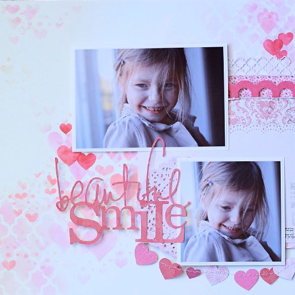
the colour for this month is red...which includes pink in the spectrum!
i could not resist the hearts to go with it.
you could use photos that had a valentine theme. or something from everyday. most of us use photos of people who smile...so the title should work for all of us as well! i prefer not to use pre-made titles that limit the use of photos we can pick from. i am also in need of more title ideas....if you have one, please share!
the class dates are scheduled:
Thursday, February 28 from 6 to 9 pm {sorry full}
Saturday, March 2, from 10am to 1pm {3 spaces available}
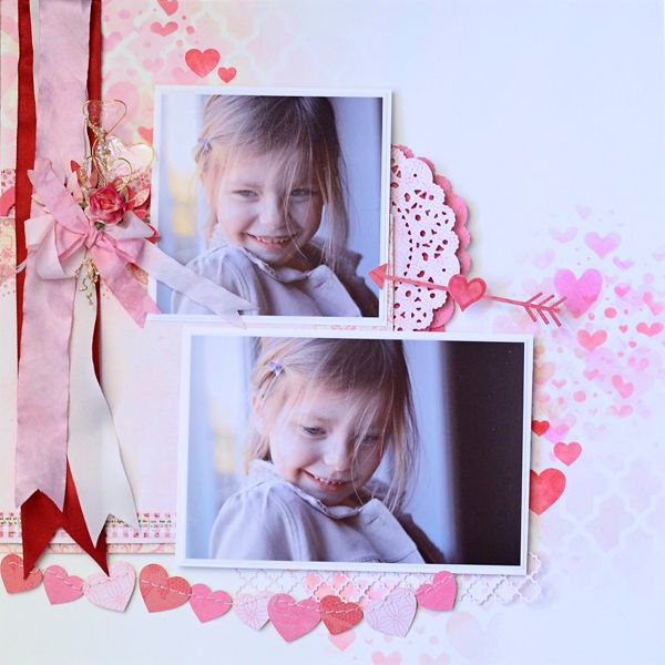
my inspiration for this layout came from a few places.
.jpg)
.jpg)
a few papers from Glitz....Hello Friend.
i adore the fade out look of the patterns.

and this children's craft from Martha Stewart.
here are some details....

the frosted film arrived and i missed it. i had completely forgotten about this product that debuted at the Summer 2012 CHA trade show. then a second order came in and it was suggested that i try it out. it is amazing!!
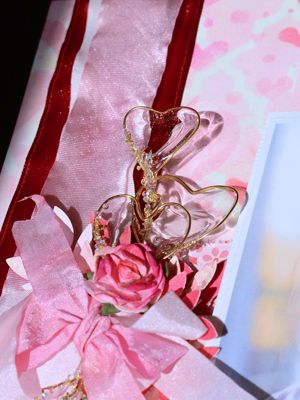
these embellishments will be made as one of the techniques demonstrated in the class. i cannot wait. there was much excitement in my house they day these were made! i expect that my students will become just as giddy. can. not. wait.
here are the full pages again:
please excuse the photo quality. the days when i needed good sunlight to take this photo....it was either cloud or warm light at the end of the day. the background paper colour is more true in the top photo. there really isn't any of the yellow that the second photo suggests.
a few people commented that i used the same photo 4 times. it appears that way. except they were 4 separate photos taken barely seconds apart with my DSLR on continuous action. a handy little feature!
i'm looking forward to the students who are returning for another year, and meeting those who are joining us for the first time. it will be a great year, filled with lots of COLOUR!
No comments:
Post a Comment
Thank you for taking the time to comment!